Tuesday 26 March 2013

Amy's Ice Cream

It's quite difficult to find quality ice cream packaging out there! Phew. But this is what I discovered. and I believe it's worth mentioning.

Amy’s Ice Cream is a boutique ice cream shop with seven locations around Austin, Texas.  The designers for this Ice Cream were Eric Timmerman, Hector Guerra and Misa Valenzuela.  I believe they did a great job, but not so convinced with the Choc Crunch tub.  Compared to the rest it's seems a bit forgotten and left behind. But putting that though beside for just a minute, it's a great eye catching look for ice cream overall.  I would certainly buy it the moment I lay eyes on them! Compared to other ice cream brands, this is seriously an improvement!


Sunday 17 March 2013

For the love of chocolate

ompartes Chocolatier has been a Los Angeles chocolate tradition for over 60 years.  Their artisan chocolate confections and chocolate truffles are handmade using the freshest ingredients and everything is made from scratch, using no artificial additives or preservatives.

But what the packaging concerns, there's really something there.  Recently they released a world series packaging, where each wrapper represents a different part of the world.  Together it makes a colorful picture and at the same time captures the different cultures around the world.


I'm in love with it!

Thursday 14 March 2013

Thirstday: Beefeater Gin

This week we're looking at Beefeater Gin of 2012 limited edition souvenir  bottle.  It's really outstanding from the original bottle, which is limited in use of color and design.

The bottle was created by Coley Porter Bell to celebrate the energy and diversity of the real London. "The message in the bottle is that if you want to see the real London this summer you have to take a deeper look."  The red wrapping represents the red of London Buses, phone boxes and pillar boxes, all very unique to London.  A transparent panel in the shape of a Beefeater provides the conventional tourist view of London.

However, if you want to see the real London you have to take a moment to look inside the bottle. On the inner surfaces of the shrink wrap is a montage of images celebrating the diversity of contemporary London life and its creative culture.


Here is what the designers had to say:

“We wanted to create an interesting souvenir for those coming to London this summer and we wanted to stand out from all the other memorabilia,”said Coley Porter Bell design director Stuart Humm. “We thought that the idea of ‘being in the know’, giving an insider’s view of London, was a compelling way to communicate Beefeater’s London credentials. It was a logical step to put the images of London on the inside of the packaging. It adds intrigue, stands out on shelf and is very different.”


This is a very interesting bottle to look at, and definitely  a fantastic way for it to pop out of the normal gin category on the shelves.

Monday 11 March 2013

Dead is the Easter bunny...

Oh FINALLY someone who moved away from the cliché easter packaging when it comes to easter eggs!


Casa Rex, a multi-awarded international design consultancy has developed a new series of Easter packaging for Brigaderia — a Brazilian confectionery store that sells brigadeiro (a type of brazillion bon bons) sweets. Last year (2012) they have taken Brigaderia back to more nostalgic times, recreating advertising prints from the 50′s and the 60′s.

“We adapted old prints that had been used to promote popular products such as margarine, soap and even a television – all of which have nothing to do with brigadeiros. What makes the new packs unique is the positioning of the brigadeiros where the old products used to be. By combining vintage images with vibrant colours, the visual identity becomes a picturesque representation of old advertising set within a new context. At such times of the year when brands tend to use similar visual codes, there is nothing better than getting away from clichés”, says Gustavo Piqueira, head of Casa Rex and also the creative director of the project, together with Samia Jacintho.


Casa Rex has created a series of presentation boxes for the brigadeiros as well as bigger trays and stickers. Seeing as this is an Easter packaging, it's is also limited edition and one of a kind.  When seeing this on the shelves, there's no doubt in my mind I would notice it instantly, as it's not your typical Easter bunny with pastel colored eggs under his arm. 

D o you agree? Feel free to comment below!


Sunday 10 March 2013

Chocolate with attitude

Now, if there is a brand of chocolates I would save from a fire because of the oustanding packaging, it's this.  Chocolates with attitude, the name says it all. And to top it all it's a limited edition!

The chocolates is created by Coca Luxery Chocolates, and they are to die for.  Each box contains 12 smaller boxes which represents a personality. The personality is expressed through a unique quote, a unique design and a unique type of chocolate.


Amongst other chocolate brands, this one is a fantastic  example for outstanding, rare packaging which will catch your eye immediately and make you fall in love with it! 

Easter time!

Seeing as Easter is around the corner, I would like to showcase nestle's Easter limited edition packaging from 2011.

Each chocolate egg filled metal can was illustrated by the brazilian illustrator Cako Martin and designed by FutureBrand.  It's an exciting way for sales to go up within this period, when consumers tend to buy more chocolate eggs and other easter related desserts.  The metal cans can be serious must-haves for consumers, as it add to the feeling of owning a limited edition packaging which can be used again for other purposes.


It's really eye-catching and the bright colors adds to the happy, cheerful feeling of easter time! I only wish I had one of my own...

Walker's Chocolates

The Walker's family has been creating chocolates in a very traditional way for the past 30 years.  The only problem with this was their brand which started to draw the more aging generation, their loyal customers.

So they decided to create a  new type of packaging, something to help their chocolates to stand out from the crowd and to draw attention to younger generations. The solution was a transformation from a utilitarian box to a beautiful gift box with the extended value of not having to buy additional wrapping paper when buying it as a gift!

Great thinking!


Saturday 9 March 2013

Opening up the world of packaging

Do you ever get the feeling that beautiful packaging is beyond your reach? As if your local store makes sure only the worst types of packaging reaches their shelves?  Well I sure do.. 

That is one of the next reasons I created this blog, not only to share our love for packaging, but also to see and experience it in real life.  So, here's the challenge:

Go treasure hunting in and around your town, and find at least one (per month) limited edition or rare type of packaging, buy it and load your pics onto the blog or on facebook. and by rare packaging I mean packaging that's not ordinary, and stands out from the crowd of normal, boring packaging.

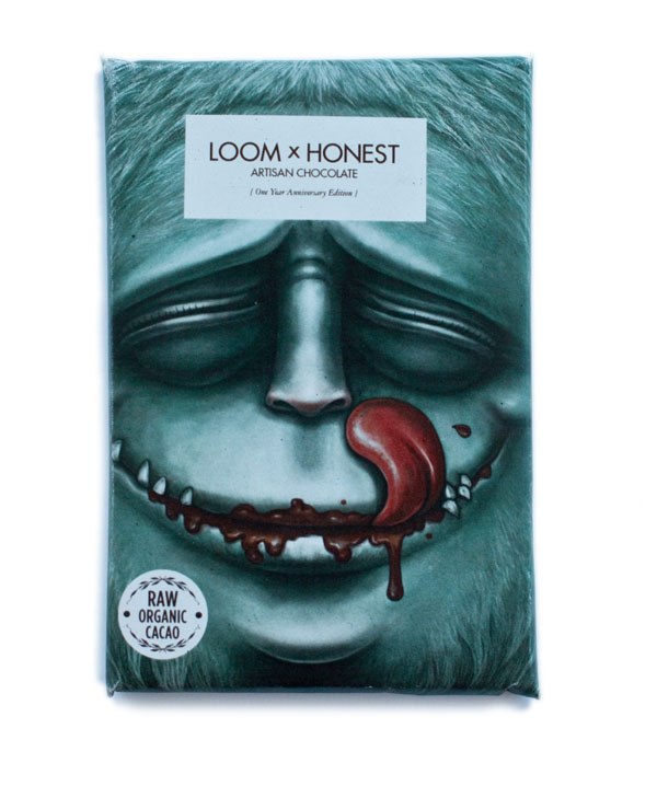
Remember that March is our sweet tooth month, so any rare chocolate or ice cream packaging are especially welcome!  I already had a head start with my Honest Chocolate last week, so get going!

And here is how we will start seeing more beautiful packaging within our reach:
Pin the locations where you found or saw any limited edition or rare packaging on the Packaging treasure hunt map,

<iframe width="425" height="350" frameborder="0" scrolling="no" marginheight="0" marginwidth="0" src="https://maps.google.co.za/maps/ms?msa=0&amp;msid=208985273689318777299.0004d77d9ab9899221bcd&amp;ie=UTF8&amp;t=m&amp;z=6&amp;output=embed"></iframe><br /><small>View <a href="https://maps.google.co.za/maps/ms?msa=0&amp;msid=208985273689318777299.0004d77d9ab9

Excited much? I am!


Thursday 7 March 2013

Let's be Honest

While I'm snacking on my limited edition Honest chocolate I told you about a few days ago, I came across the same chocolatiers with another limited edition up their sleeves!

A while ago Loom, a men's multi-brand fashion shop in Johannesburg, celebrated their 1st birthday.  They collaborated with the artisan chocolatiers,Honest Chocolate, in Cape Town to release a limited edition chocolate for this event. A competition for the design was held and attracted over 115 designers from all over the world in just 6 days! As for the flavor...it consisted of 72% cacao with hints of cayenne pepper, cinnamon and vanilla.

The winners were Studio Muti, in Cape Town, and only 365 of these slabs were released.  There are still some left for us to get our hands on! They are currently being sold in Johannesburg at Loom (Shop 22, Corner 4th Avenue & 10th Street, Parkhurst) and in Cape Town at Honest Chocolate (66 Wale Street) but you need to hurry if you'd want one!