Sunday 19 May 2013

Thorsteinn Beer Brand


GOODNESS gracious! What a fresh approach to label design! Here's what the creators had to say:

"This beer brand concept was born on a sunday night at school were we were supposed to make a brand for a micro-brewery. The name is traditional Icelandic name that could be loosely translated into "thirsty one".

The concept is to have one beer, 10 different bottle designs by 10 different designers. The design would be changed annually and could be put on beer glasses as well.

We decided on making versatile design but limit it down to a single color graphics. Our approach was different, but we all shared the same ideology about breaking out of the ordinary and making graphics that aren´t exactly typical for beer bottle labeling. The concept also makes the brand a platform for other graphic designers to show off their own design for design`s sake."
Thorleifur Gunnar GĂ­slason, Geir Olafsson and Hlynur Ingolfsson, Iceland.

Binche beer

Finally a beer with a feminine touch! I'm loving this

Binche beer is a new premium Belgian beer. What is binche? Binche is a name of the town in Belgium that was famous of their lace. The main target market of this beer are woman and we see that through the lace designs around the bottle. The look of the package is modern but traditional as well.

Still a student work but it's still remarkable.


Tuesday 14 May 2013

St. Stefanus


I'm certainly not one for tradition and traditional ways . But if I have to admit,  St. Stefanus beer is something I would surely buy if ever I get my hands on one.

When you look at the label created by Brandhouse for St. Stefanus, you are seeing history. In fact you are seeing almost 700 years of beer brewing tradition, dating back to the Augustijn monks who originated the recipe. Some elements of the font used on the bottle and label even come from songbooks found in the Augustijn’s monastery library.

Hope you like it! 

Wednesday 8 May 2013

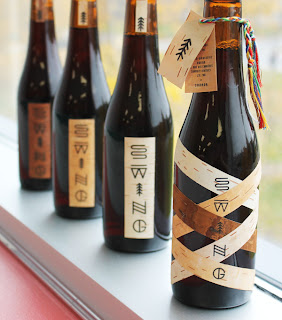
Swing Mikrobrewery

Here's one to catch your eye.


Breaking away from a western approach to branding, graphic design student, Simon Langlois created packaging with a different style than the ordinary beer on the shelf.

This limited edition is produced and used exclusively during the launch party of the Swing brewery. The label is composed of strips of different coloured birch that criss-cross to represent the blend of cultures that make up Quebec’s identity today.


This Quebec vernacular typography was used for the logo of the Swing brewery. The shapes of the letters were inspired by Native American petroglyphs considering many Quebecois identity symbols are borrowed from Native American culture. (The racket sinew, bark canoes, fur, etc.)Native American petroglyphs illustrate these concepts and elements of natureas the Amerindian language was primarily oral. We can observe a river (s), spruce (i), etc.
within the logo.

The information was printed on a label then attached by a braided twine made up using the traditional colors of Quebec’s arrow belt.

Friday 3 May 2013

This is May

And before I knew it, May is on our doorstep! In April and May, we covered a whole lot of alcohol, and you might be wondering where's the wine category? Well, I will be covering that part later on , maybe in October.  I decided to split up the alcohol packaging to get a better variety throughout the year.

So this month I am covering beer! All amazing beer packaging you might have seen , you are more than welcome to share your experiences with me.  We will be looking also to limited edition craft beer and how alcohol packaging can create a differentiation to other brand.

I hope you are excited! For a more constant and daily feed, try visiting Shelf Life's Facebook page http://www.facebook.com/pages/Shelf-Life/512037942168145