Here's one to catch your eye.
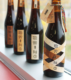
Breaking away from a western approach to branding, graphic design student, Simon Langlois created packaging with a different style than the ordinary beer on the shelf.
This limited edition is produced and used exclusively during the launch party of the Swing brewery. The label is composed of strips of different coloured birch that criss-cross to represent the blend of cultures that make up Quebec’s identity today.
This
Quebec vernacular typography was used for the logo of the Swing brewery.
The shapes of the letters were inspired by Native American petroglyphs
considering many Quebecois identity symbols are borrowed from Native
American culture. (The racket sinew, bark canoes, fur, etc.)Native American petroglyphs illustrate these concepts and elements of natureas the Amerindian language was primarily oral. We can observe a river (s), spruce (i), etc.
within the logo.
within the logo.
The information was printed on a label then attached by a braided twine made up using the traditional colors of Quebec’s arrow belt.


No comments:
Post a Comment